

Color doesn’t just decorate a clinic. It directs the nervous system.
Blue Is a System Default. You Deserve a Redesign.
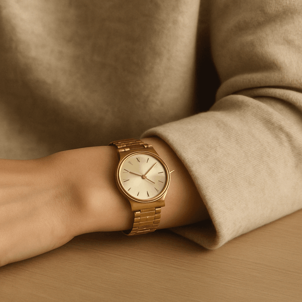
Pale blue is the medical industry’s lazy security blanket. It’s the shade of outdated scrubs, plastic gloves, and hallways that haven’t changed since the ‘90s. Sure, it’s “calming”—but so is silence when no one’s listening. At thrē, we don’t recycle hospital codes. We reprogram them.
We swapped blue for warmth, shadow, softness, and contrast. Because the brain doesn’t feel at ease in environments built like waiting rooms. It feels safe in environments built for women.
Color Can Regulate of Re-Traumatize. Pick One.
Women step into clinics carrying more than symptoms. Medical trauma. Dismissal. Shame. And the colors around them either disarm that tension—or reinforce it.
At thrē, we use neutral tones, textured layers, and just enough contrast to let your nervous system exhale. Nothing too bright. Nothing too sterile. No walls screaming “you’re just another appointment.” Because healing happens when the body believes it’s not under threat.
Clean Doesn't Have to Mean Clinical
We reject the idea that sterile = safe. You can signal cleanliness without looking like a lab. You can be minimal without being cold. The key? Intentionality. Organic tones. Sculptural forms. Thoughtful lighting. Creams, stones, and soft charcoals that feel lived in—not wiped down.
It’s not “cute.” It’s not trendy. It’s trauma-informed, nervous-system-supportive healthcare design. And yes—your care is worth that level of detail.
This Is More Than Aesthetic. It's Strategy.
Every hex code, every hue in this clinic was chosen to do something—not just sit there. Reduce heart rate. Soften sensory load. Cue presence. Extend eye contact. Make your body feel like the priority instead of the problem.
Because here’s the truth:
Most healthcare color theory stops at “calm.”
thrē builds to connection.

Let’s keep in touch.
Discover more about high-performance web design. Follow us on Twitter and Instagram.
